When looking for pieces in my magazines, I ended up finding a lot of pages with pinks and yellows. I thought that the colors worked well together and I was able to create unity with the consistent color scheme.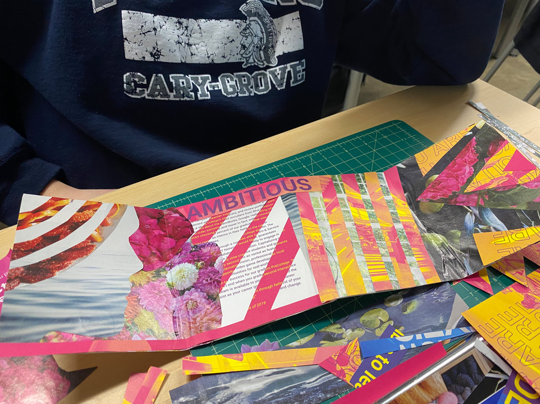
0 Comments
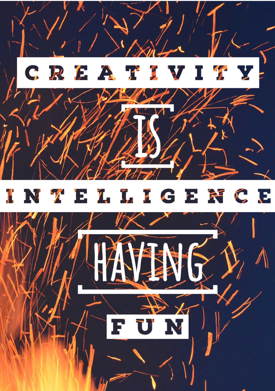
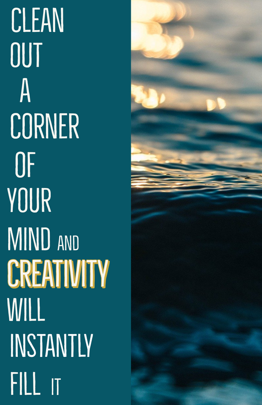
The square project was annoying to make on google slides, but it still turned out decent. I decided to share my playful slide. I made the squares all different sizes to show motion. 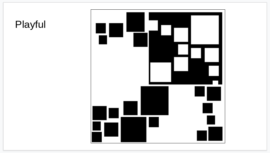 In the first quote, I wanted to emphasize the letters by making them white against the dark background. In the second quote, I highlighted the word creativity because it was the most important word in the quote. I definitely prefer Illustrator over Spark. The controls were very limiting and sometimes very annoying, but I still think I am happy with my designs.
I am almost done with Lines 3. I have added some color but I still need to add more. I also might change the colors around. So far this project has not been too challenging. I would still like to change the order and arrangement of some of the lines. 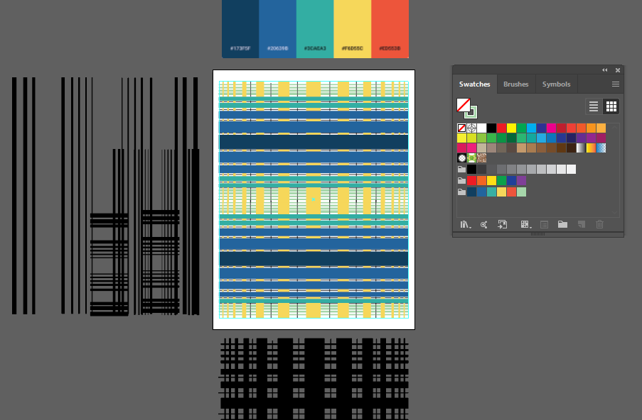 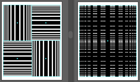 |
AuthorWrite something about yourself. No need to be fancy, just an overview. Archives
March 2020
Categories |
 RSS Feed
